Development of a logo for the recreational complex 'Hospitable Dwelling on the Slopes of the Carpathians'

Client
Carpathian Slopes Resort
Task
In the Carpathians, in Nyzhnia Rozhanka, there is a recreation complex called 'Carpathian Slopes.' A place for cozy, family-oriented leisure. The Carpathians are mountains with plenty of greenery, clean air, and a unique culture. The task was to create a fresh, modern, recognizable style that reflects all the advantages of leisure in the Carpathians.
Project implementation
Year 2020
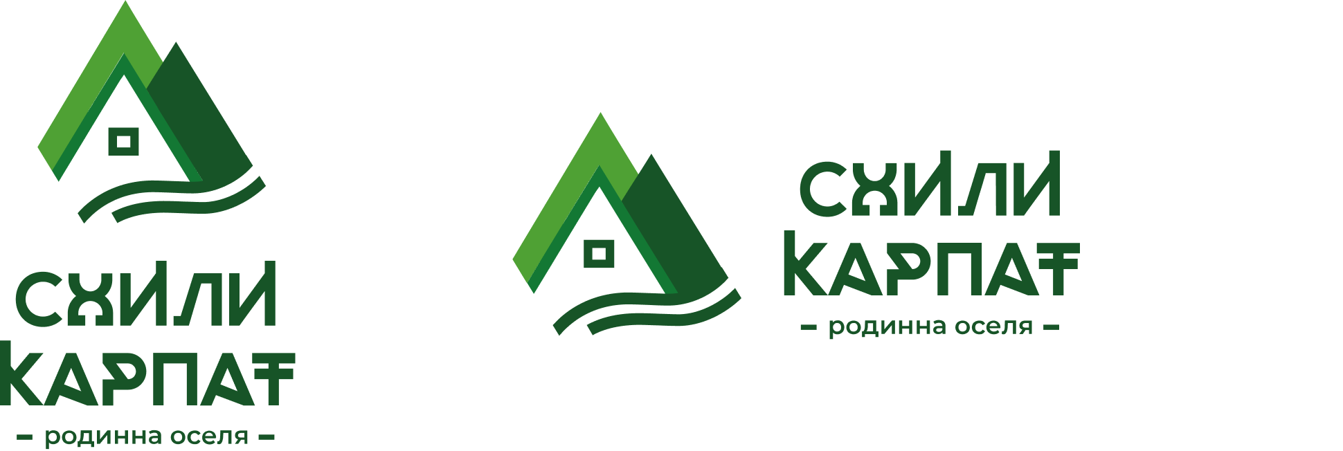
The logo design for use in silk screen printing.
The type of logo for use in digital printing and on the internet.
Logo
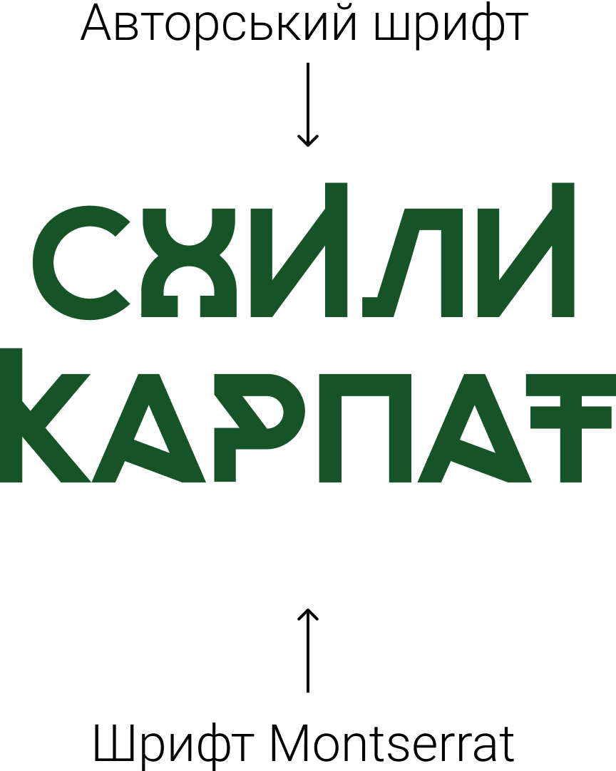
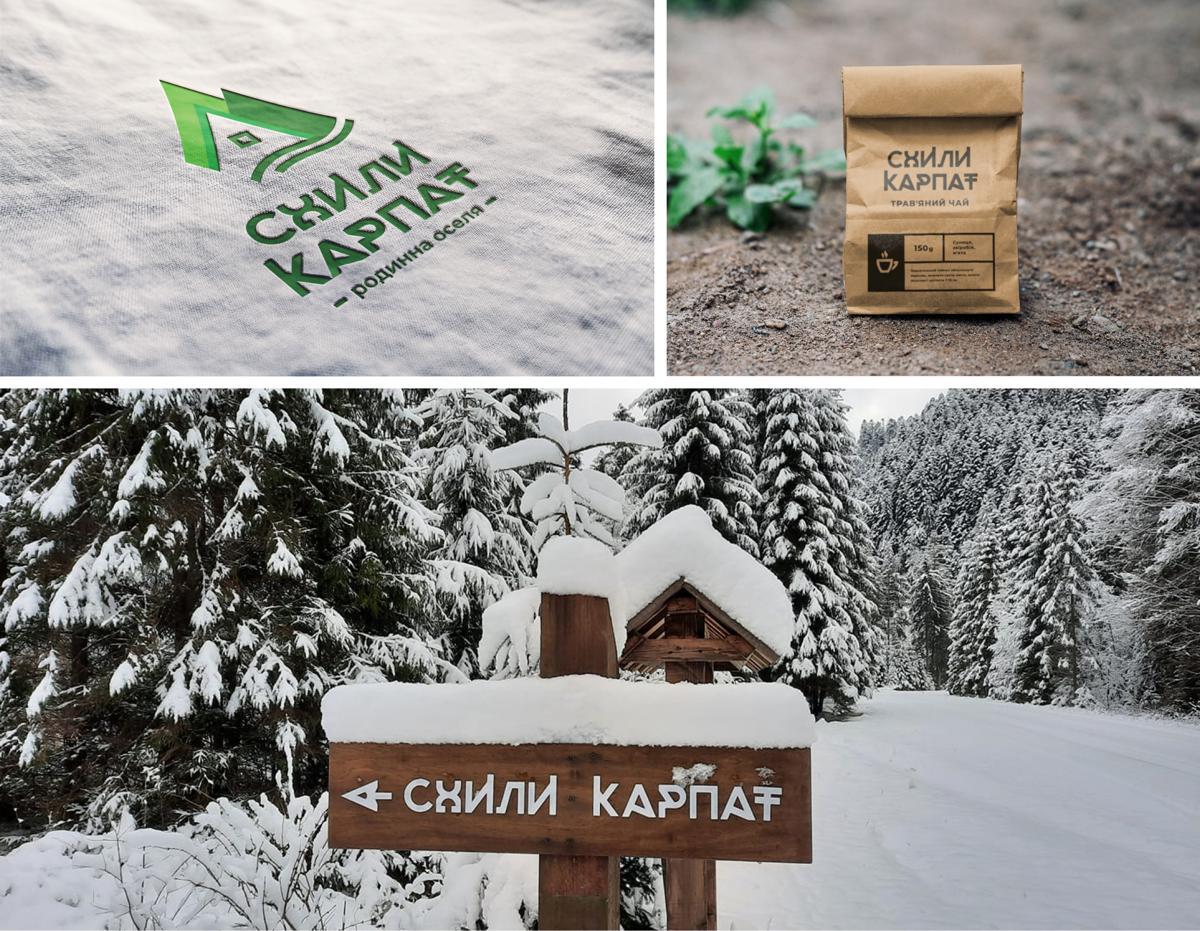
The key and primary identifier of the brand is the logo. The name of the welcoming complex "Skhily Karpat" speaks for itself, so the keywords are family, dwelling, slopes. Our main goal was to convey the three key words, three important descriptions of the establishment without unnecessary words. Therefore, the logo is created based on the needs of people and the complex's proposition. The logo takes into account all the technical conditions of its full use, maximum association, and various usage methods from horizontal to vertical. The logo is multifunctional, concise, contrasting, attracts attention, and remains in memory. For complete organicity, we created an author's font that echoes the Hutsul style and localizes the location of the object.

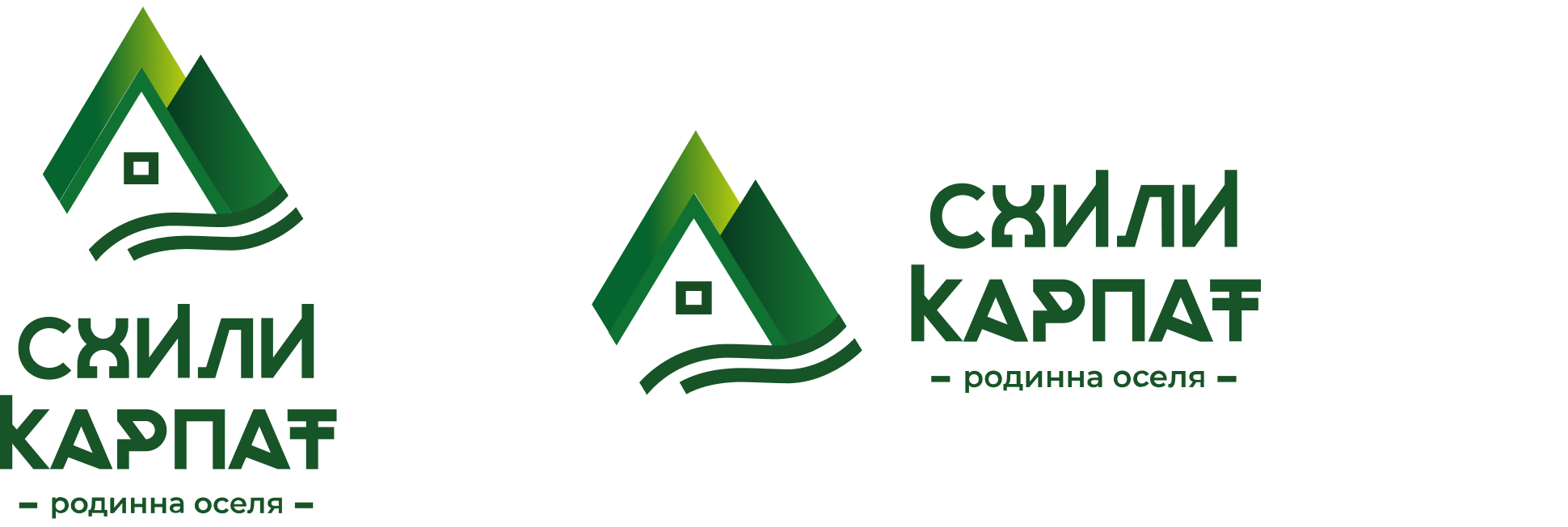
The color palette
The color palette is inspired by the four seasons: winter, spring, summer, and autumn.
The color of the logo and patterns resonate with the nature of the Carpathians, featuring abundant greens and evoking a sense of summer.
The color palette includes cool tones reminiscent of winter forests and mist. We convey autumn through yellow hues, while spring is represented by light shades of green.
Printing
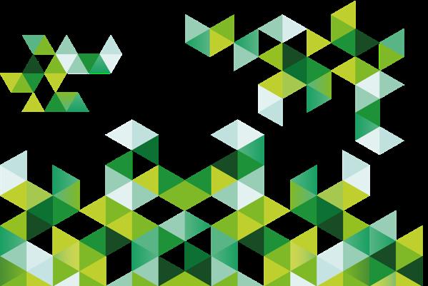
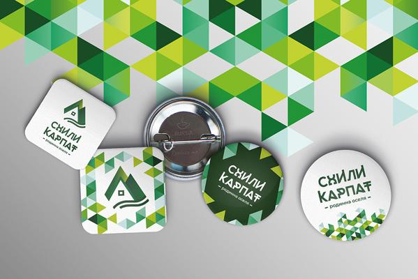
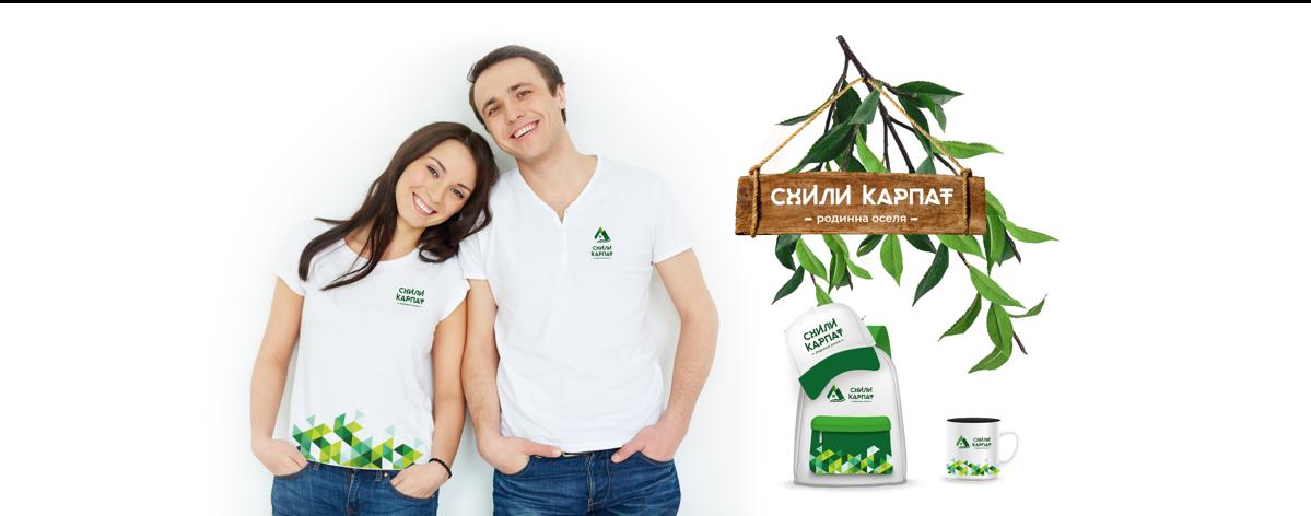
For effective brand recognition, positive association, and memorable impact, we created a chaotic pattern that unifies the visual appearance across all print materials.
A light, unobtrusive pattern, yet with sharp angles reminiscent of Hutsul ornaments and the triangular shape of the mountains. The pattern is designed in a modular style, capable of adapting its composition based on application needs. The concept of using the pattern is applied across all possible souvenir carriers, as the pattern is suitable for various types of application.
Solution
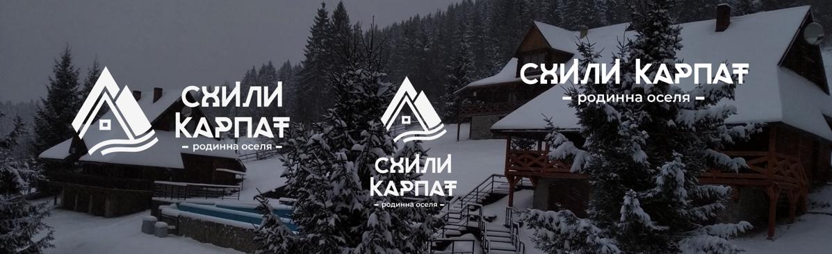
We analyzed the location of the complex and the features of the region, identified and surveyed the target audience. Observing neighboring leisure complexes, we concluded that most adhere to a heavy, 'wooden' style, using a lot of wood and carvings. In turn, we wanted to deviate from this stereotype while emphasizing the region's aesthetics. We opted for a light style with an emphasis on ecological awareness, using vibrant green colors on a clean white background. The logo reflects the location, consisting of mountain slopes, the peak of a building, and a river—all harmoniously combined in a simple, concise style. For added dynamism and recognition, we used a pattern of triangular elements, echoing the logo and highlighting the mountain slopes. Overall, we adhered to the idea of conveying ecological awareness, lightness, and cleanliness.
Our agency offers a full range of services, optimized for maximum efficiency and customer satisfaction.
Focus on what you do best, and leave the rest of the business digitization tasks to Abra Agency !